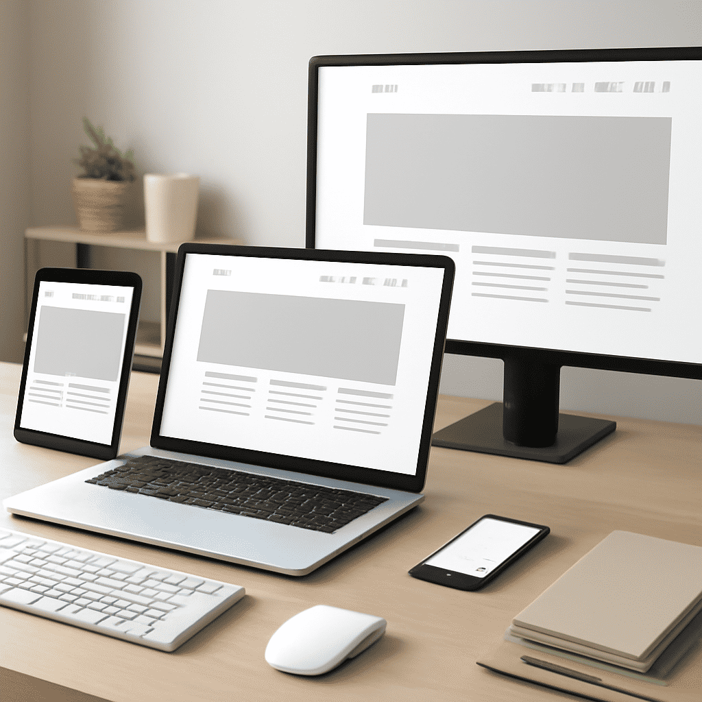
In today's digital age, having a site that looks great and functions seamlessly across all devices is more important than ever. This is where adaptable design comes into play. The concept focuses on creating experiences that are consistent and efficient, no matter whether the user is on a desktop computer, tablet, or smartphone.
At the heart of creating adaptable sites lies the principle of fluid grids. Unlike the fixed grids of traditional layouts, fluid grids scale in proportion to the user's screen size. This means that elements on the page adjust automatically, preventing any layout shifts or overlaps that can disrupt user experience. By employing percentage-based units rather than fixed pixel dimensions, fluid grids allow for smooth scalability and a clean look across numerous devices.
Another critical aspect of adaptable design is the use of flexible images. Just as grid layouts need to be scalable, images should also adjust to maintain their relevance and visual appeal no matter the size of the screen. This can be achieved by utilizing CSS techniques that let images resize within their containers, ensuring they don't exceed their bounds and maintain their aspect ratio. This avoids awkward cropping or pixelation, which can deter users from fully engaging with the site.
In addition to these technical elements, it's important to consider touch adaptability. Given the prevalence of touchscreens, interfaces should be designed with touch in mind. This includes having buttons that are appropriately sized and spaced for tapping, and including gestures like swipes or pinches where applicable, to create a richer interaction experience.
Another factor in adaptable design involves optimizing text readability. Content should be easily digestible on any device, which entails choosing readable fonts and allowing for adjustable text sizes. Implementing line heights and spacing that work well on both small and large screens can significantly enhance the reading experience.
One cannot overlook the role of user feedback in refining adaptable designs. Gathering insights from actual users regarding how a site performs on different devices can identify areas that need improvement. Regular testing and iteration based on feedback are essential to ensure the design remains up to date with user expectations and technological advancements.
In conclusion, adaptable design is a crucial element in creating websites that meet the needs of a diverse, device-using audience. By focusing on fluid grids, flexible images, touch adaptability, and textual readability, developers can create seamless experiences that engage and delight users, emphasizing the importance and benefits of adaptability in today’s fast-paced digital world.